Why Gmail 2013 Sucks
I'm upset with the new Gmail. I've been using Gmail since it first came out in 2004. Back then we all coveted the invites. Back in 2004, if someone asked you "did you get an invite", you knew exactly what invite. It was "the" invite. I've been in love with it ever since -- until recently when I was forced to upgrade to the new UI. It's terrible. I've been trying to not upgrade for the longest time but now it's mandatory. It's terribad.
This is why the 2013 Gmail sucks
1. I can't easily delete my signatures. You know when you're messaging back and forth with people, you sometimes strip out your email signatures to reduce clutter and make it more readable and less formal? Now you have to click on three tiny dots and then do it. And sometimes I forget because it's hidden from view. This is crappy. It's not user friendly.

2. I can't easily change my email subject. Sometimes you're replying or forwarding an email and you need to modify the subject. For example, you want to modify an email to send to someone else. It takes 3 clicks!! You first click on type of response. Edit subject. And then click into the subject. This is stupid.
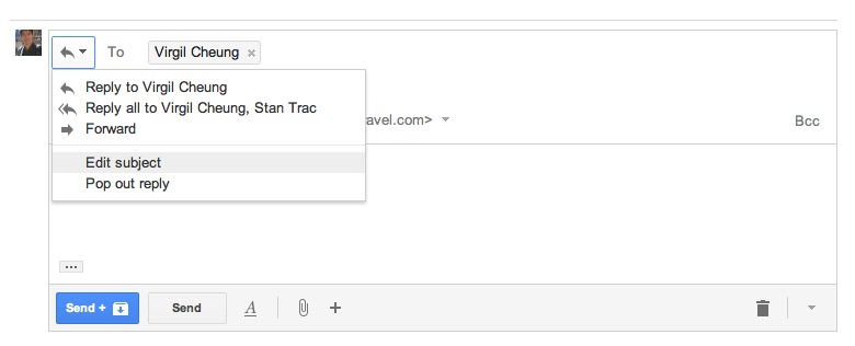
Furthermore, it violates a powerful UI heuristic:
Recognition rather than recall - Minimize the user's memory load by making objects, actions, and options visible. The user should not have to remember information from one part of the dialogue to another. Instructions for use of the system should be visible or easily retrievable whenever appropriate.
3. Ok, so what if you want to insert a link or something. You have to hover over the + and then can click. That's 2 steps instead of one. If I wanted something so minimalist I would use gmail on my iPhone. It's not even saving space! You still have the bar there. If you really didn't want those buttons visible you can make them appear on hover over the whitespace of the bar instead.
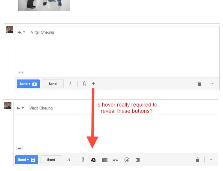
Furthermore, I actually liked the check link feature that took you to the link URL. That's gone now.
4. Rapportive doesn't work. You know when you're writing to someone, how awesome it is to see their latest tweets and see who they are? It's also an error prevention feature to confirm the email you're using is correct. By breaking Rapportive and obscuring information such as the recipient's email address (only showing the name), hiding the "from" and "subject" fields, and concealing the signature part, Gmail makes it a lot easier for users to send flawed emails because users are not able to double check these fields.
Usability Heuristic: Error Prevention - Even better than good error messages is a careful design which prevents a problem from occurring in the first place. Either eliminate error-prone conditions or check for them and present users with a confirmation option before they commit to the action.
5. You can't easily get access to people's emails. You can't easily change your sending email address. You can't easily add cc or bcc. You can't easily add bullets and change fonts. You can't easily do anything other than reply. Everything is hidden. Even after you discover where everything is concealed, it still takes twice as long to do than before. While I'm not saying have as many buttons and ribbons as Microsoft Word, these are basic functions I use everyday. And it's entirely not convenient.

If you want to access and copy the sender's email you need to click on a tiny little show details button.
It's not only the clean desk versus messy desk argument. It's also stop putting away the things I'm currently using. I might like to have a clean desk but if I'm writing a letter, I don't want to open my drawer every time I want to reach for a piece of paper, pen, pencil or eraser.
So they're breaking another usability heuristic:
Flexibility and efficiency of use - Accelerators -- unseen by the novice user -- may often speed up the interaction for the expert user such that the system can cater to both inexperienced and experienced users. Allow users to tailor frequent actions.
You want to make something easy to use. But this feels like I've went from an automatic car to a standard. Why do I have to do all this work? Is it saving me gas? Is it more fun? Personally, no this does not make email more fun for me nor does it appear to be saving me gas.
In conclusion.
You're making something more basic and harder to use in favor of minimal design. This isn't search. You can't reduce a full-email platform down to a message box. If I wanted that, I'd use Facebook which supports email now.
There is a tradeoff in HCI that is between ease and efficiency. It seems Gmail is less easy to use AND less efficient. The only improvement seems to be design.
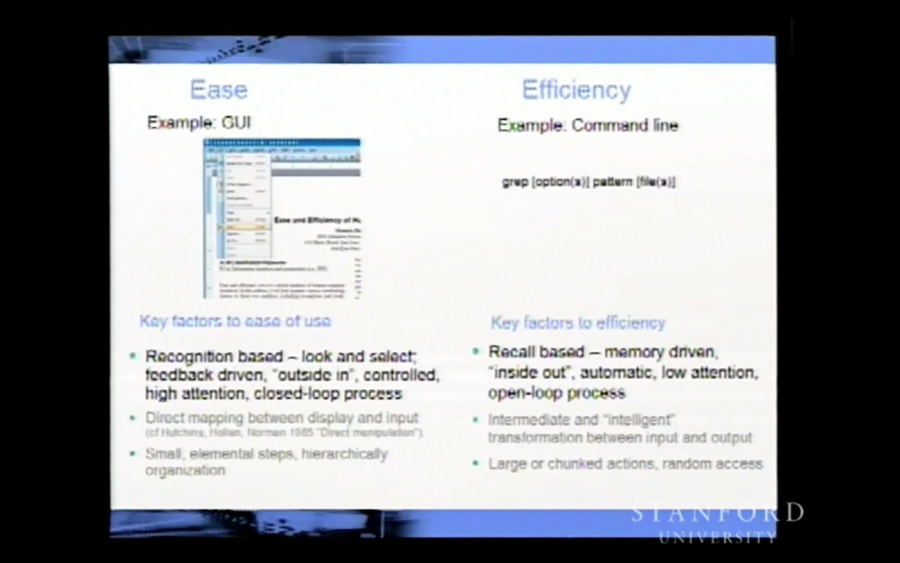
I'd prefer to have the functions mentioned above be more accessible. Maybe a shortcut that just pops up the advanced editor mode. Or have a simple mode that's basically like the gmail app for people who actually find this new Gmail usable. I can't be the only one who hates the new Gmail?
I'm so annoyed by how unfriendly the new interface is for me I've even decided to learn more Gmail shortcuts. Here are a couple useful ones for the New Gmail 2013.
Reveal the CC box: Ctrl + Shift + c or Mac: ⌘ + Shift + c This will also bring up the from email field :D so you don't need to memorise that shortcut. However, there is no shortcut to edit the subject field.
Replies to all message recipients: a
Moves the conversation to Trash: #
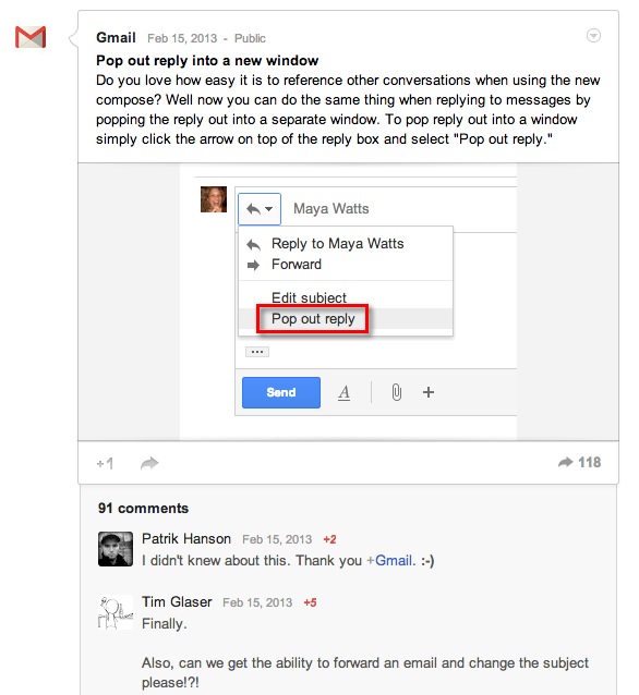
Unfortunately there's no real shortcut for popping out to reply in a new window. It's funny how people didn't know that it was possible. I wonder if they did usability studies and asked people to change the subject... And if they did, did they just ignore how many couldn't figure it out or how much longer it took them? In my case, I know it possible but it's still a hassle, I'd like a shortcut as a bandaid to this terribad UI.
I'm also using Live email more. It's definitely getting a lot better and is a real competitor to Gmail now in my opinion. I also feel their integration with Skydrive is better than Gmail's integration with Drive, but that's another topic.
This picture probably best sums up how unusable and silly the new 2013 Gmail is.
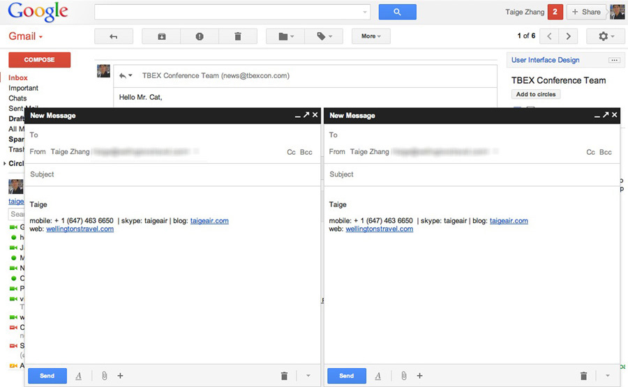
Update: May 3rd, 2013 Wow. I wanted a discussion on this but didn't realise it was going to be this big. From the Hacker New discuss page, I realised I forgot to mention the new picture attachment design flaw. By attaching a picture, it inlines the picture into the email body. But if you don't want it in the body (aka delete picture from body), you don't know if the picture is still attached. No visual feedback to user.
Related articles:
FastCompany - How A Tiny New Compose Window Could Reinvent Gmail
Quora - Gmail: What are the six types of email users identified by Google? Quora
Ghacks - Temporarily switch back to old compose mode
Gizmodo - Gmail shortcuts cheat sheet
